PlutoPay
A native iOS mobile app designed during CareerFoundry’s immersive course. It allows users to send and receive payments, categorize transactions, and create budgets.
Challenge
More Millennial households are in poverty than households headed by any other generation. According to Richard Fry, a senior researcher focusing on economics and education at Pew Research Center, more Millennials have outstanding student debt, and the amount of it they owe tends to be greater.
Young professionals between the ages of 25-35 on a tight budget need a way to manage their transactions and budget in a streamlined way.
Role
End-to-End Product Designer: Research, UX design, UI design
Timing & Tools
October 2020 - June 2021
Miro, Figma
Deliverables
Research, analysis, personas, user journey, wireframes, prototype, visual design, testing
PlutoPay Features
Pay & Request Transfers
Direct money transfers are being used for important bills like rent. 98% of surveyed users consider money transfers a crucial feature in a payment app. PlutoPay offers a sleek and simple way to pay or request payment.
View & Categorize Transaction History
88% of surveyed users want to view a transaction history in their payment app. However some users can find it tedious to categorize these transactions. PlutoPay keeps the categorization process simple and customizable for users.
View & Manage Budget
It can be a challenge to budget when income is limited. PlutoPay’s budgeting feature is an opportunity to stand out in the market. 87% of surveyed users keep a budget but on 50% use an app or online service.
Research
The market for finance apps is saturated. According to the 2020 edition of The State of Finance App Marketing: 2020 Global & US Trends, globally, finance apps topped the charts as the second largest category for number of apps and sixth largest for total installs.
My research was focused on conducting a competitor analysis of the highest rated apps to learn what these apps do well. Then I learned where they can improve through user interviews. Based on these user needs, I created User Personas to help guide my design.
Risk
There are many payment apps that already serve the target audience. It could be a struggle to stand out. As we are dealing with sensitive information, one barrier is convincing an audience to sign-up and enter their information when they likely already use one of the competitors.
Opportunity
The target user base has needs which are not being served by the competitors. There is a chance to bring a holistic financial picture to payment apps.
By focusing on niche functionality that is effective for users, PlutoPay can attract budget-minded professionals between the ages of 25-35 on a tight budget and make a positive impact on their financial health.
Competitor Analysis
PayPal and CashApp are both popular money transfer apps, topping the app store charts, and offer additional functionality and value to their users.
PlutoPay will allow users to go beyond sending and receiving payments by giving them tools to categorize those payments into budgets and produce data about their spending.
Cash App stands out in the market as a payment app that helps you get your money to work with you.
PayPal stands out in the market as the payment app that has been on the market the longest and has the greatest visibility for big brand partnerships.
User Survey
40 responses were gathered from Facebook, Slack, and WhatsApp communities. Of these responses, 85% were in our target demographic of ages 25-35.
Survey Insights
97% of users consider a send/receive money feature to be crucial to a finance app.
About 50% of users budget to meet their basic needs, maintain their lifestyle, or save in case of emergencies.
While 85% of users tend to keep a budget, only 50% of users use an app to track their budget.
From the survey, I learned that including a budget feature could give an advantage in the market of finance apps, especially when paired with a transaction feature.
User Interviews
I interviewed three individuals within the target demographic who currently use finance apps. I set out to learn more about their current finance app habits as well as their budgeting habits due to the results of the survey.
Interview Insights
Budgeting: While there is interest in budgeting, simplicity is best.
Transactions: A robust transaction history is appealing to users. Customization, search functions, incoming and outgoing tracking.
Peer-to-peer: Transactions between individual peers should be a main app feature.
User Personas
I analyzed comments made during user interviews and used them to shape my user personas.
User Test
I conducted moderated remote user tests via Skype and Zoom. There were Six participants ages 25-30 living in major metropolitan areas of the United States.
Key features tested:
- User log-in
- Transaction management
- Sending payment requests.
User Test Key Insights
Categorize Transaction task flow needed revision. 2 separate errors occurred for more than one user.
Before - no confirmation or save option which confused users.
After - an ‘apply’ button has been added and colored as primary.
Updated UI for Pay / Request Transfer flow. 2 users made an error due to unnecessary elements.
Before - 2 users clicked the ‘amount’ field instead of using the key pad to add an amount.
After - the key pad is not necessary on mobile, replaced with clearly labeled the entry fields
Preference Testing
I conducted a preference test using a Helio Poll with 17 participants.
Preference Test Insights
These preference tests offered feedback indicating that potential users prefer a clean, streamlined design, and are attracted to the multi-functions of the app.
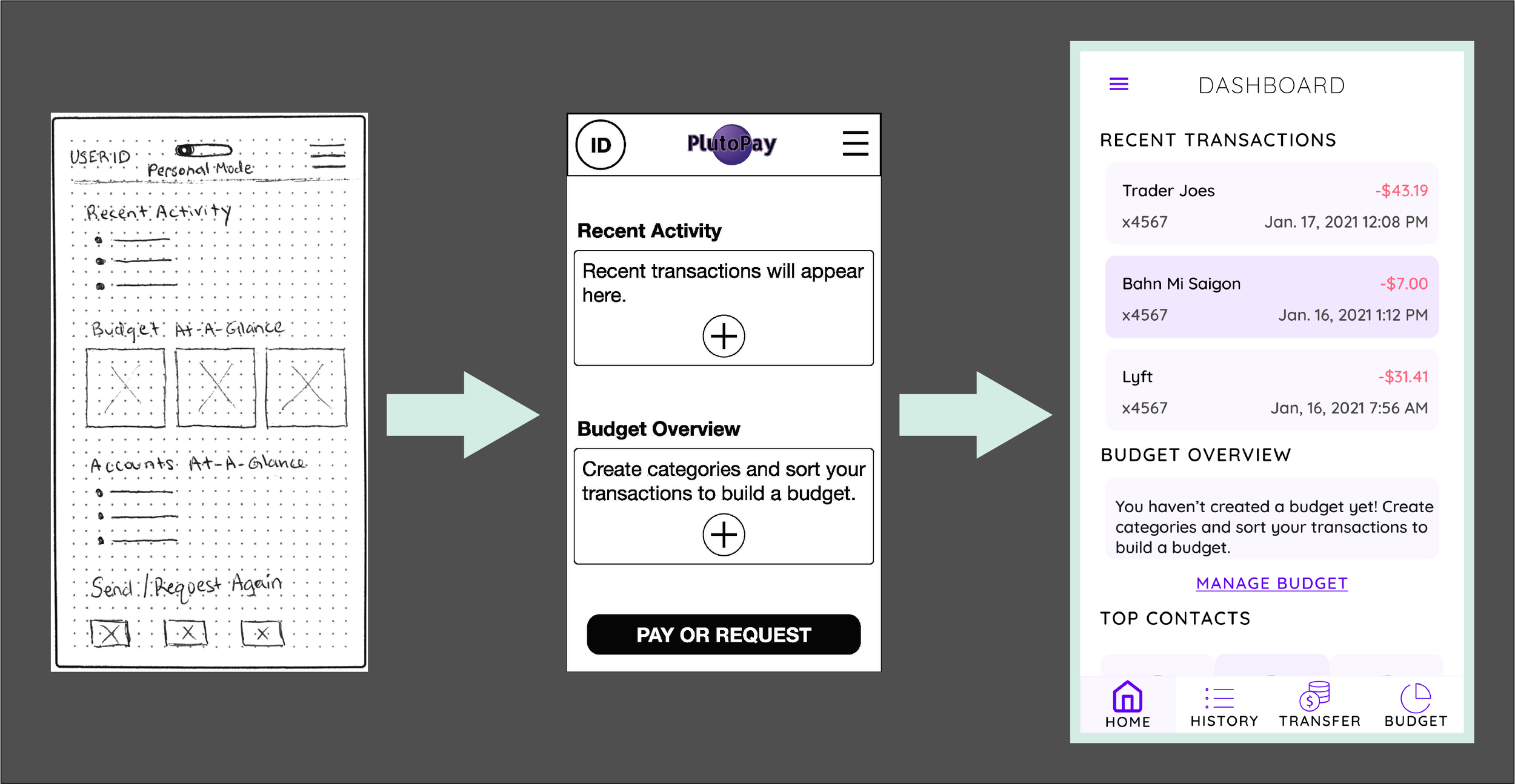
I planned to apply this feedback to refine the design of the home page and dashboard, as well as to solidify the UI for the app.
65% preferred a navigational footer to a quick-start ‘pay or request’ button on the dashboard.
Design
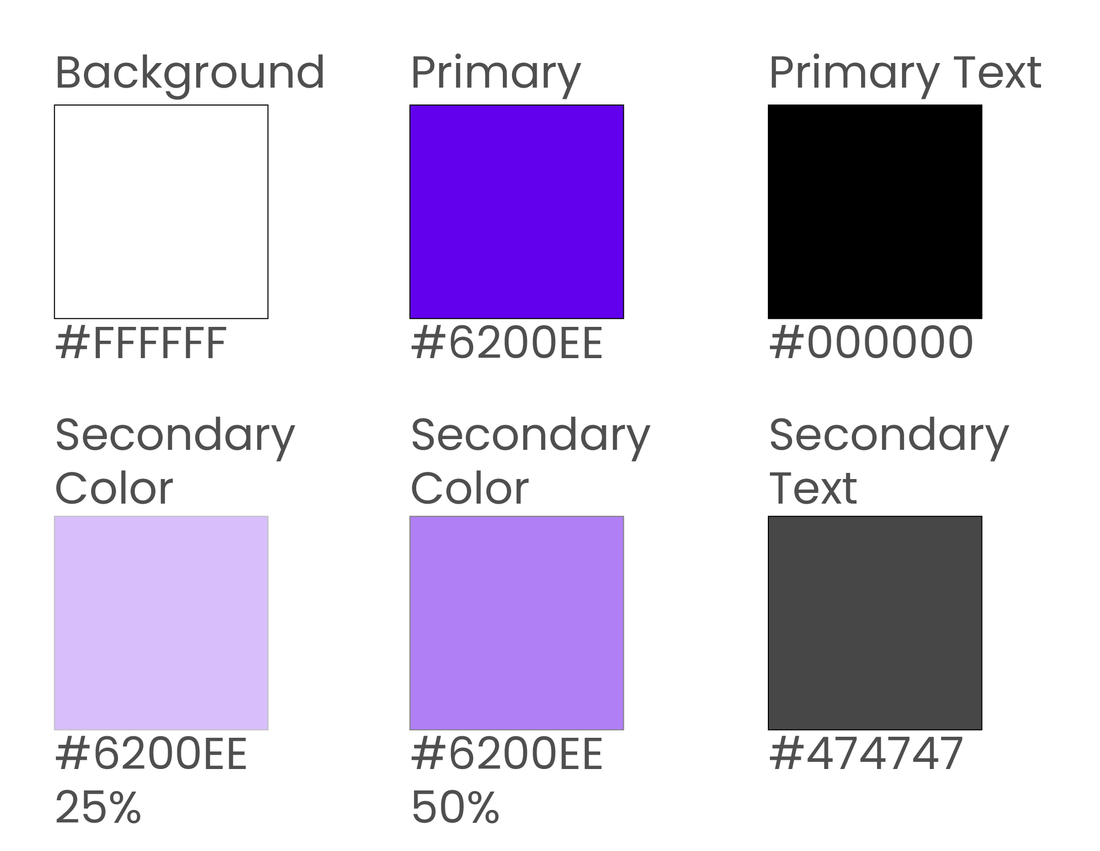
Purple is a royal color, and can represent wealth and wisdom, two important traits for a finance app. As the primary color for PlutoPay, the vibrant shade keeps the app from feeling dated or ‘too old’.
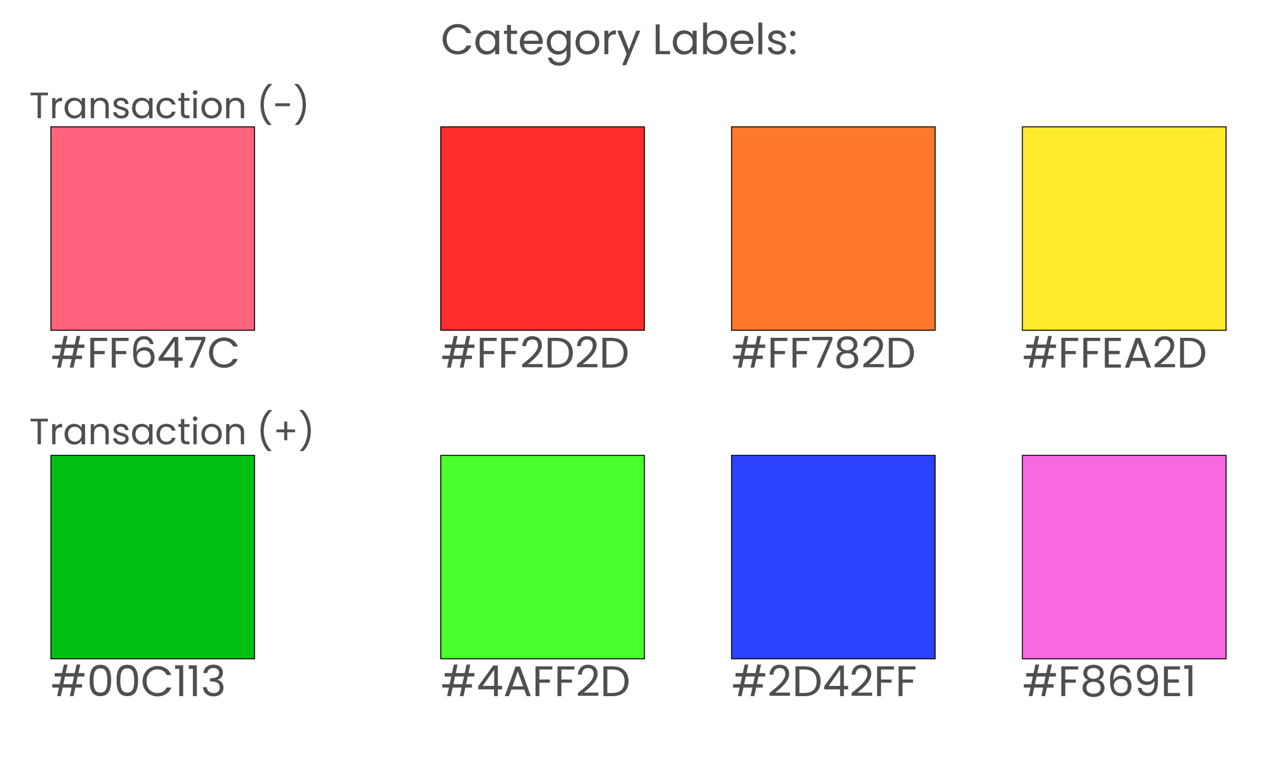
As the app has several transactional features, a color to indicate positive or negative growth was necessary. These colors should only be used in terms of transactional amounts. Category label colors should only be used in terms of category labels and budget categories.

“Illustrations look more human.” — Preference Test Commenter

The font ‘Quicksand’ is used throughout.

Top navigation includes a section heading where landing on the first page of a new section, a back button after the user makes a navigational choice, or an exit option from any overlay screens.

Buttons are rounded at the corners and are colored as primary or secondary to indicate action hierarchy. Inline buttons only appear when many other elements are present at to simplify the flow of information.
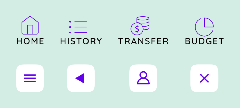
Icons are simple and colored with the primary purple. All icons are attached to an action and should have a minimum touch area of 44px x 44px

Cards are a consistent width when used on the same screen. They contain body text and can include primary and secondary information indicated by text color.
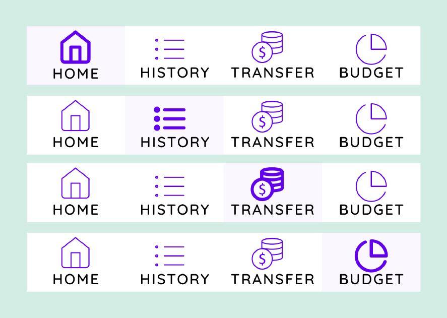
Bottom navigation uses simple icons and is highlighted by the secondary color to mark the user’s place in the app.
Prototype
With revisions made and UI applied, the PlutoPay prototype includes user login, onboarding, and three task flows: categorizing a transaction, sending a transaction request, and managing a budget to view spending insights.
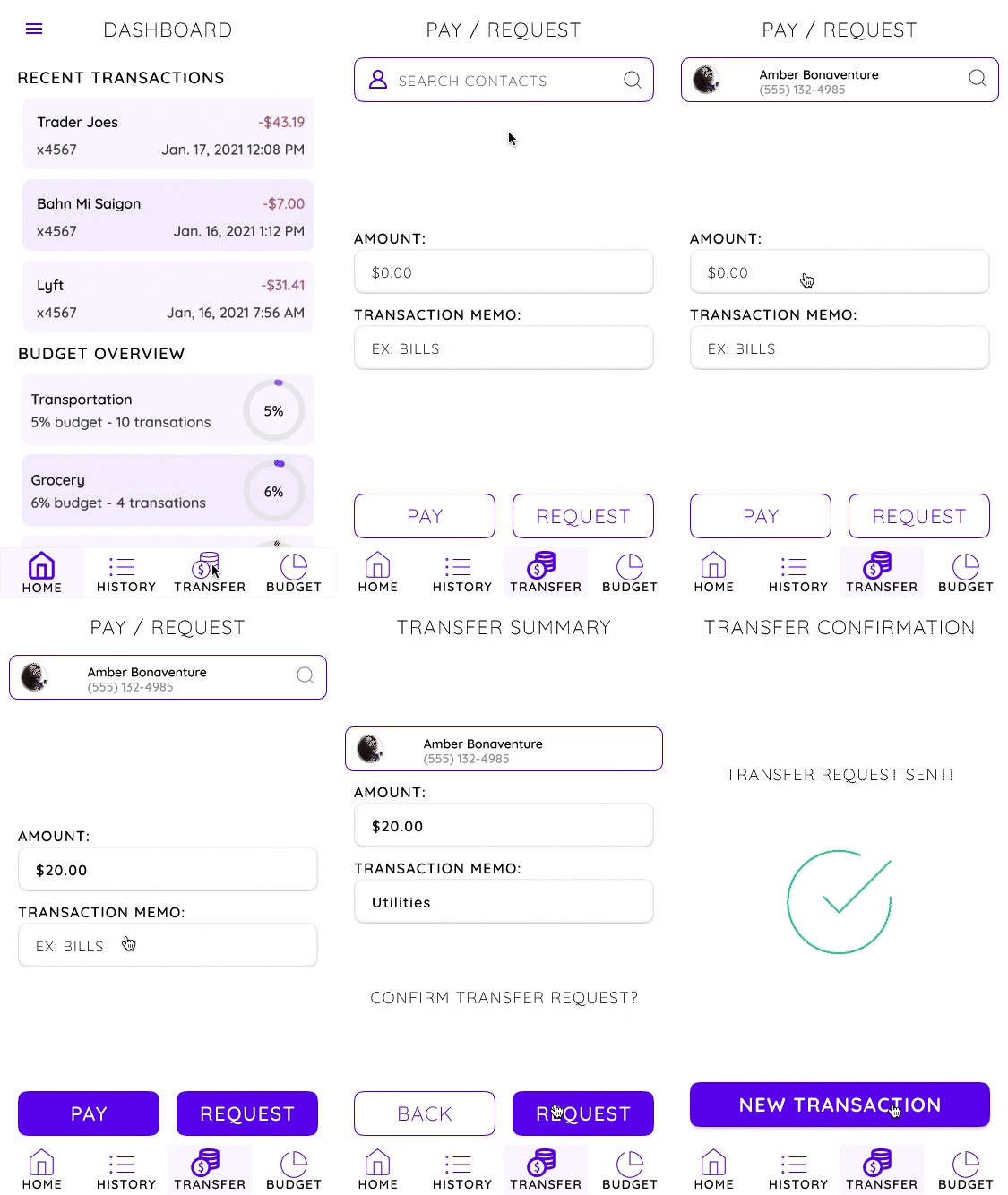
Pay & Request Transfers
Problem: Users need a reliable way to send and receive transactions.
“When I got my first apartment, Venmo was how we were all paying rent.”
Solution: Pay/Request Money Transfers.
98% of surveyed users consider sending/receiving money an important feature in a payment app.
User Flow:
Search contacts
Select contact
Enter transaction amount
Enter transaction memo
Request transfer
Confirm request
Transfer request sent!
View & Categorize Transaction History
Problem: Users need a simple way to categorize their transactions.
“I’m interested in tracking spending, but it’s tedious to re-categorize.”
Solution: Categorize from Transaction History.
88% of surveyed users consider viewing a transaction history an important feature in a payment app.
User Flow:
Filter transaction
Select filters
Apply filters
Select transaction
Search categories
Create new category
Apply new category
Apply category to transaction
Transaction is categorized!
View & Manage Budget
Problem: Users need insight to their spending and income when money is tight.
“I budgeted when I had limited funds and was waiting on a deposit.”
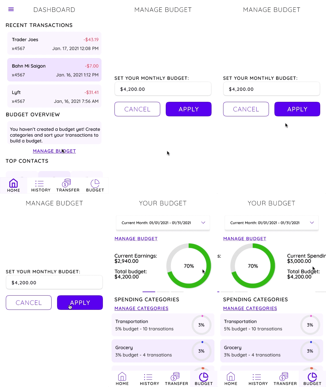
Solution: Customized budgeting.
85% of surveyed users consider keep a budget. But only 50% of users use and app or online service for their budget.
User Flow:
Manage Budget
Set a monthly budget and apply
View budget dashboard
Swipe to see current spending vs. total budget
Swipe to see category insights
Conclusion
In further iterations of PlutoPay I would want to expand upon the budgeting feature. During user testing there was great interest in this feature and I received feedback that it seemed to be a more manageable and pleasant way to budget than what is currently available. I hypothesize that users will learn about money management and budgeting through data and positive feedback. I would see this come to fruition as users connect their accounts to manage and categorize transactions and visit the budgeting page to keep track of incoming and outgoing money.
Project Insights.
Be flexible! The design of PlutoPay evolved and changed in ways I could not have foreseen at the start of the project. Now upon reflection I see that each design decision, no matter how unexpected, was made as information was gathered with the user in mind.
Don’t assume! While it is natural and helpful to have ideas and hypothesize about the outcome of research, having too strong of a bias or intentionally designing research to provide a desired outcome will only hurt your process. UX is user centered and that means truly listening to your user.
Be passionate! When starting my PlutoPay design, I would not say that I was particularly financially minded. However as the project progressed and I began to truly empathize and learn about the users I was designing for, the work became more meaningful and more fun! I enjoy learning about new things and designing outside my comfort zone is a great way to do that.

